ShopDreamUp AI ArtDreamUp
Deviation Actions


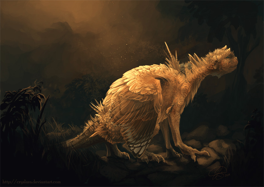
Description
This was mostly to practice texture, lighting and colour, but I like the eventual mood that came out of it.
There's not much more to say about it. Critique is always very welcome, but anything will probably be applied more in later art rather than reworking this one. (Smile)")
Tools: Photoshop, Wacom Intuos 3 tablet
Time: 6-7hours?
Music: Still - Ben Folds

There's not much more to say about it. Critique is always very welcome, but anything will probably be applied more in later art rather than reworking this one.
Tools: Photoshop, Wacom Intuos 3 tablet
Time: 6-7hours?
Music: Still - Ben Folds
Image size
842x595px 143.48 KB
© 2009 - 2024 cryslara
Comments89
Join the community to add your comment. Already a deviant? Log In
This piece...there's a lot of things I can say about this piece. <img src="e.deviantart.net/emoticons/h/h…" width="15" height="13" alt="
The mood you managed to create with such a limited palet is not only incredible but mind boggling to me. I don't know much about art yet, I still have a lot to learn, but I know that it takes skill to be able to take such a sweet and happy color such as yellow and use it to create such a bittersweet like picture. I think this color scheme seemed to project more sadness- at least to me- than any blue tones could have ever done.
Critique wise it's really hard to say since trying to find something I think needs improvement in this- for me anyway- is like trying to find a needle in a haystack. The background is simple but that just adds more attention to the main focus, which is the creature and that lovely expression- please, dont get me started on how I still can't believe how you could pull off such a completely human like expression on something that is, quite obviously, not human- so thats not even a problem I think.
Anyway, I think it would have looked nice if you had added some grass between the rocks by the creature's front claws/feet to balance out some of the grass a little ways behind it but again I dont think its a necessary thing, just one more little detail that could have been. I'm sure I don't have to tell you again, but I will, because it's true- I LOVE this picture.